We use cookies to give you a better browsing experience. Know how we use your data.
We use cookies to give you a better browsing experience. Know how we use your data.

The Tavus team had built a template-based video personalization platform that enables you to record once and automatically transform it into countless AI-generated videos customized with unique voice variables. When they came to us, they wanted to strengthen their product’s image at the back of an immersive, intuitive design.
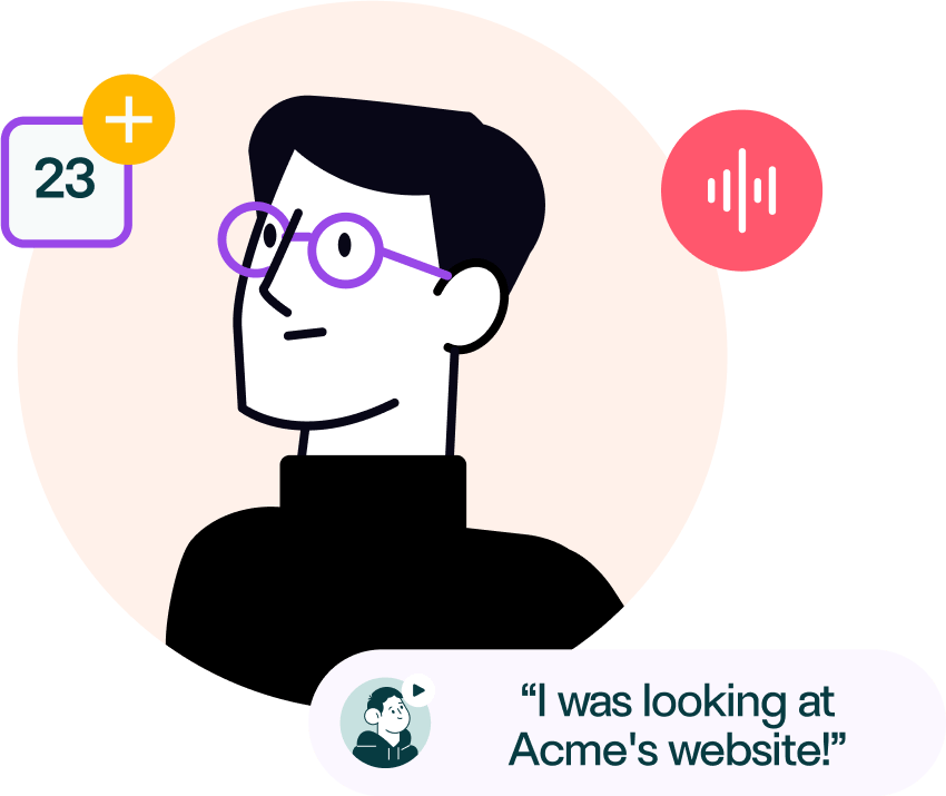
When we heard about Tavus, our first reaction was of sheer excitement. The idea behind the product was truly one-of-a-kind and had the potential to be groundbreaking for sales and marketing. The only catch was to ensure that the user experience matched the cutting-edge nature of the technology they had created.
Thorough research yielded valuable insights into target audience needs and competitor analysis. We mapped user journey for optimal functionality. Visual design prioritized user experience with a simple, impactful approach.
User research
Qualitative research
Competitor analysis
Personas
Empathy map
Journey map
Affinity mapping
In-Architecture
User flow
Low fidelity
High fidelity
Prototype
Usability testing
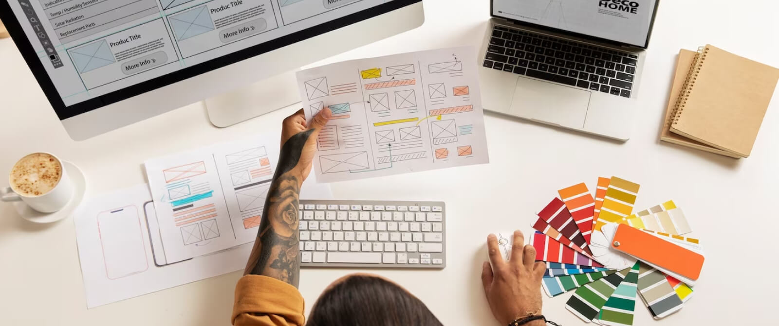
We performed in-depth research and scoping sessions to understand the target audience better.
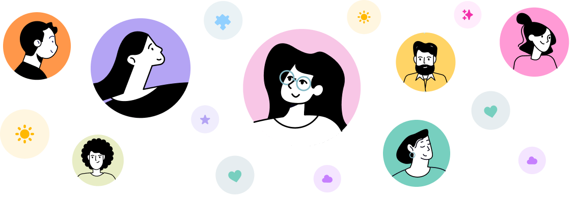

Through the insights gathered from our primary research and from real users, we re-visited the user persona.


The agenda behind the Tavus re-design was clear: we had to create an incredibly intuitive user experience, for a completely new type of product, and do it in time for them to implement and launch. The race was on.


Tavus came to us at a stage where they had some initial designs, however they were incomplete and the team felt it lacked the experience they were wanting to provide.
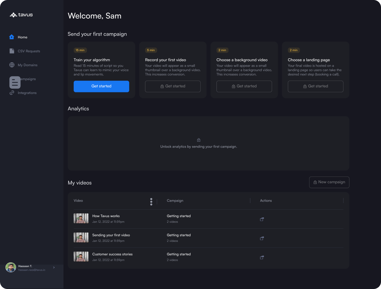
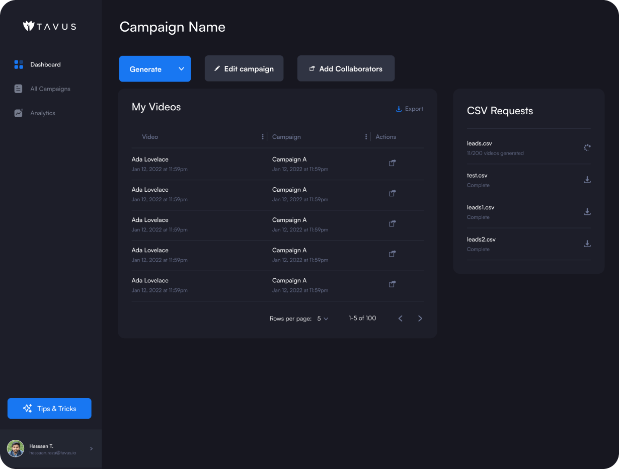
We coalesced around one central north-star: building a completely frictionless flow from sign up to getting the first video generated. Tavus called this "the magic moment".

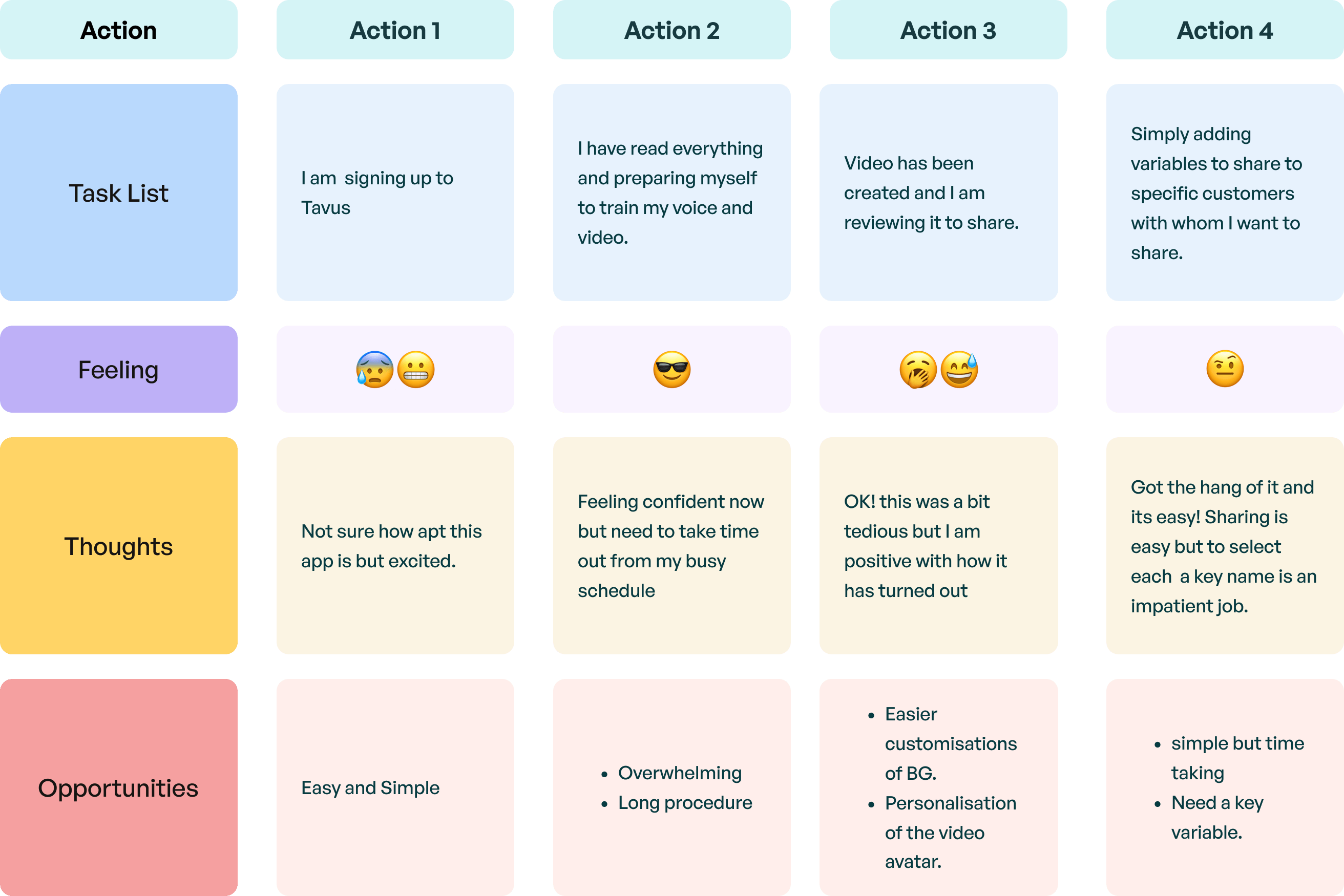
With the design effort plan now defined, we held an internal design sprint session to finalize the mood board, new user flow, and the app’s look and feel. The insights drawn from the activity were converted into a presentable format for the stakeholders.
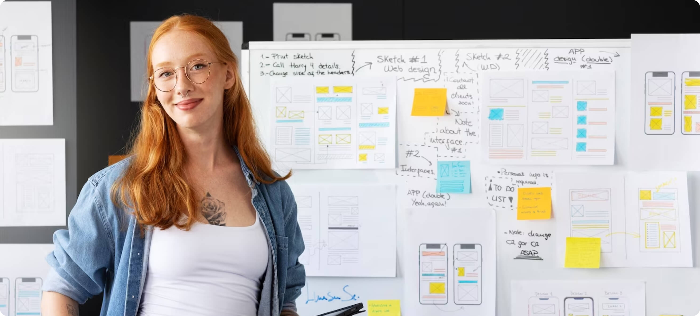
Going with our process, we conducted an initial Scoping Session to understand Tavus's long-term vision.
The existing designs Tavus was using were incomplete and impossible to build on. We had to deliver a design system that could allow them to build quickly, consistently and ultimately deliver the user experience that they dreamed of.
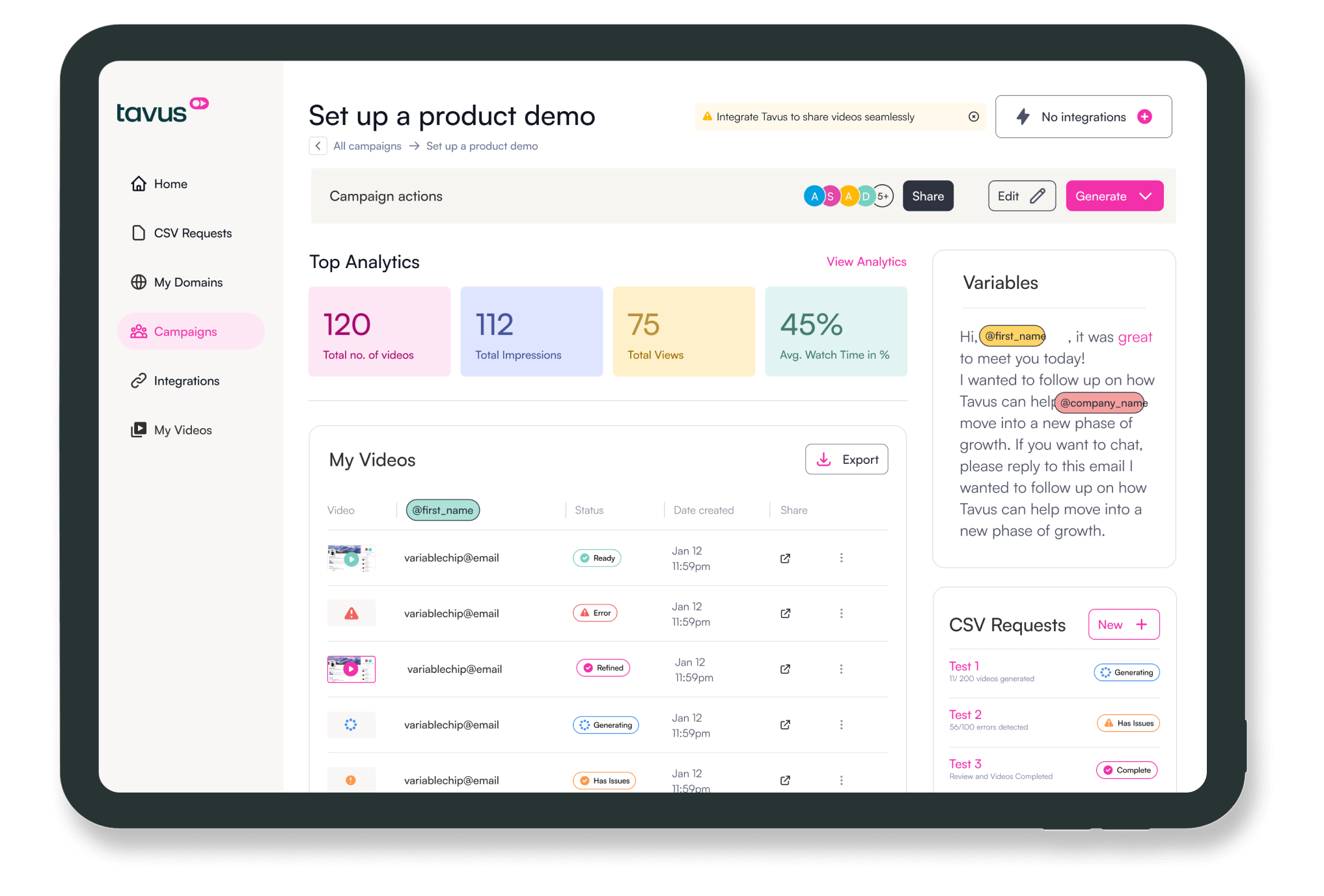
We built wireframes that acted like blueprints, conveying the high-level functionality of every page and how they connect with other sections and pages of the website on an ecosystem level.
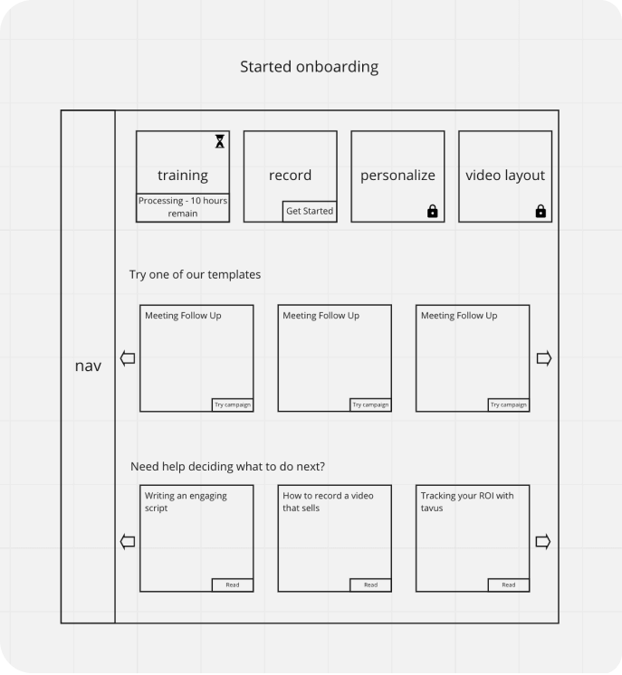
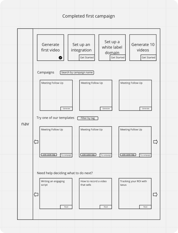
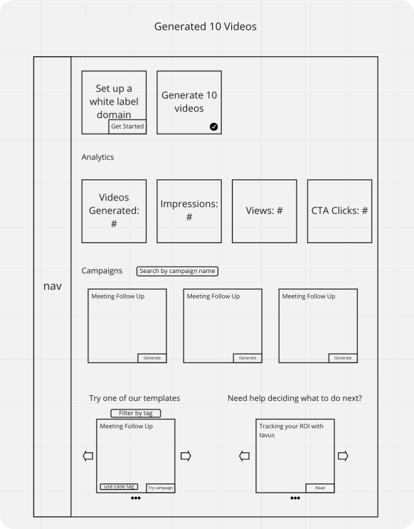
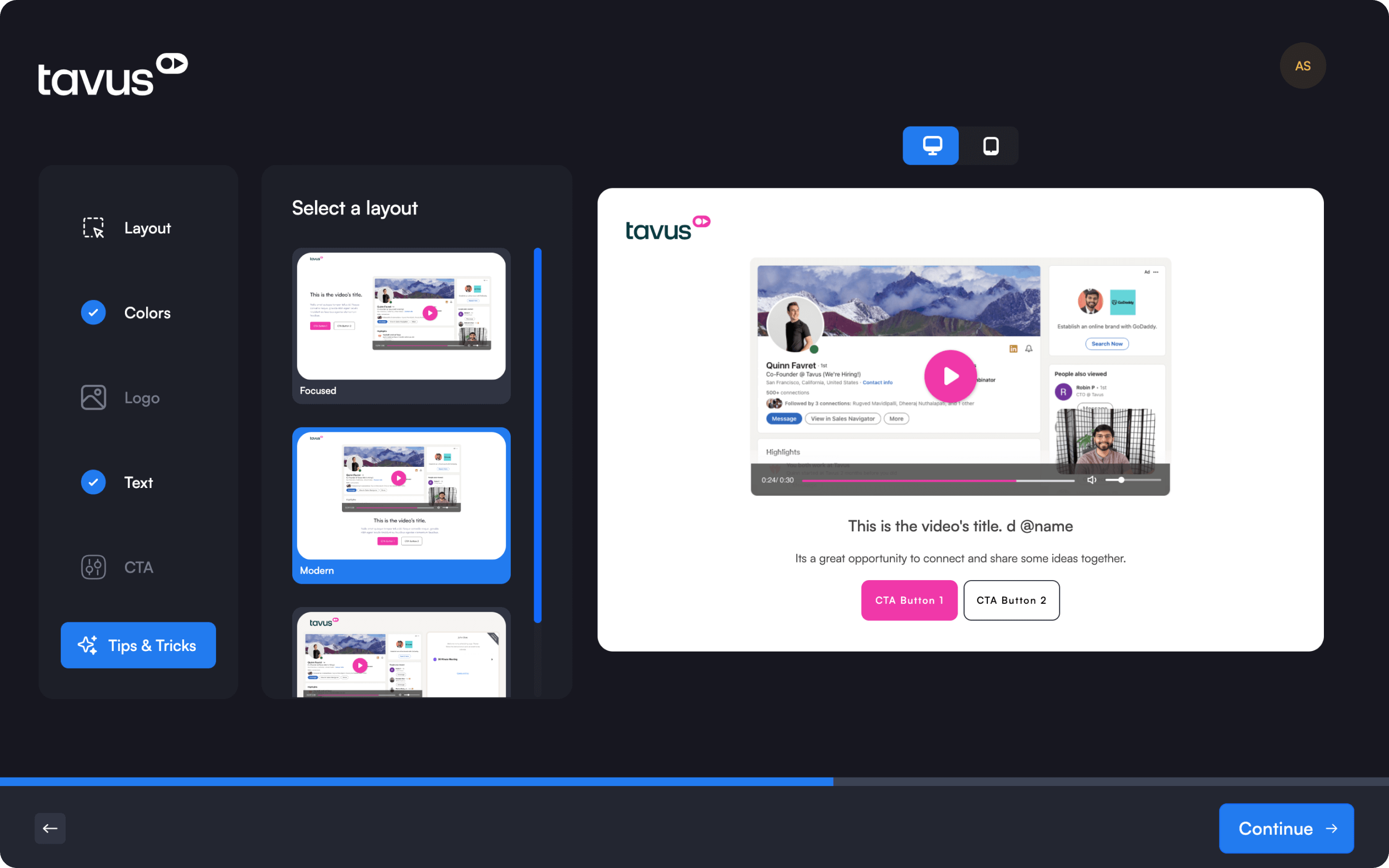
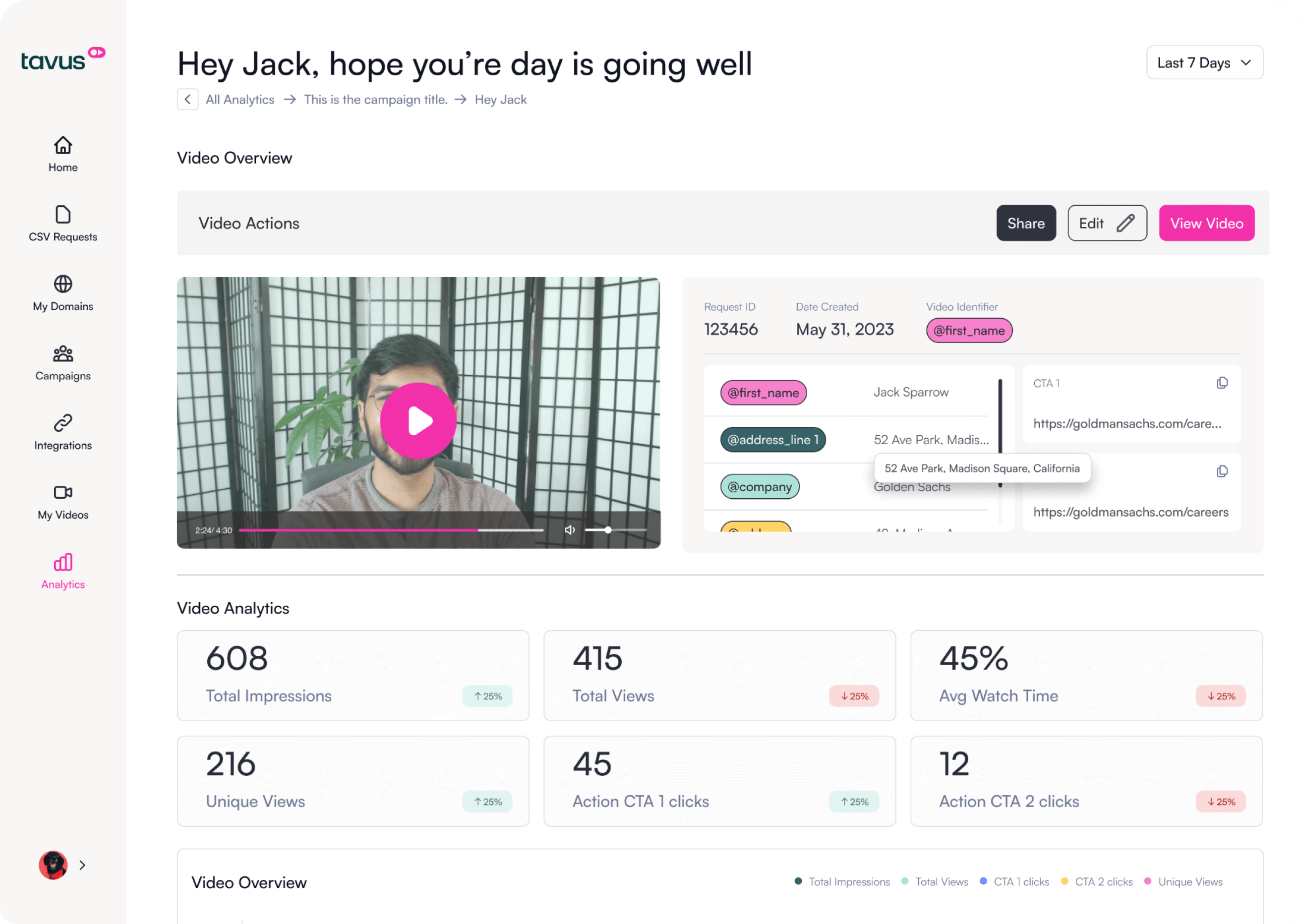
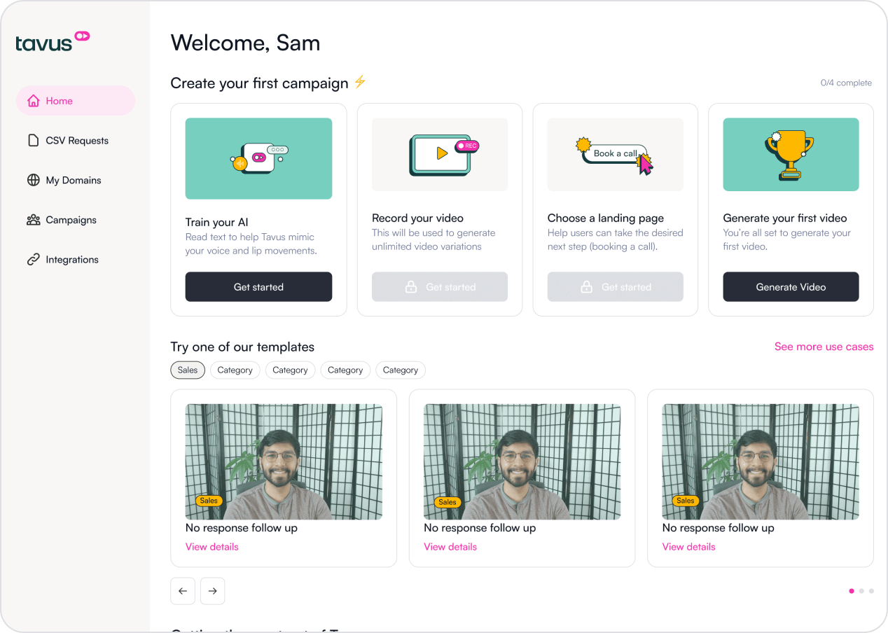
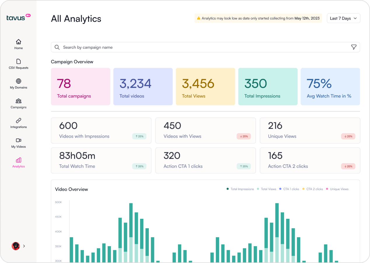
Through a human-centric approach, we created a new outlook that would help the users navigate the platform quickly and simultaneously give them ease of operation by offering them a free hand in video generation.
Eventually, via rigorous iterations and taking up a process that included a lot of to and fro with users and stakeholders, we reached a solution that would be entirely user-based - one that would empathize with the end user.

Strategic use of bright & bold colors and minimal typography balances and enhances platform appeal and user-friendliness, creating a memorable and intuitive user experience.


Creating a user-friendly platform involves thoughtful button and component design, ensuring simplicity, clarity, and cohesiveness for a positive user experience, higher engagement, and retention.

IMPORTANT: Components & variants live here, updating these will update all instances
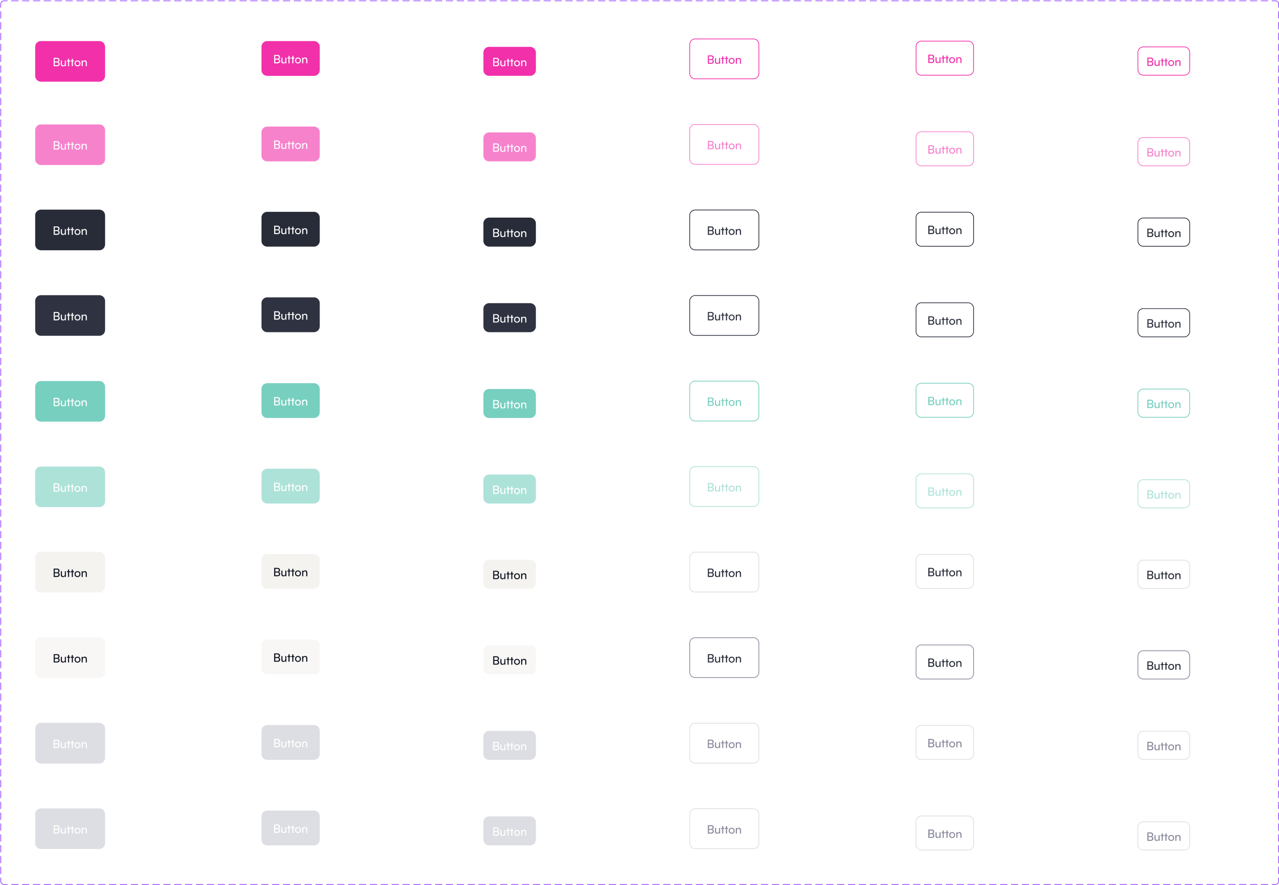
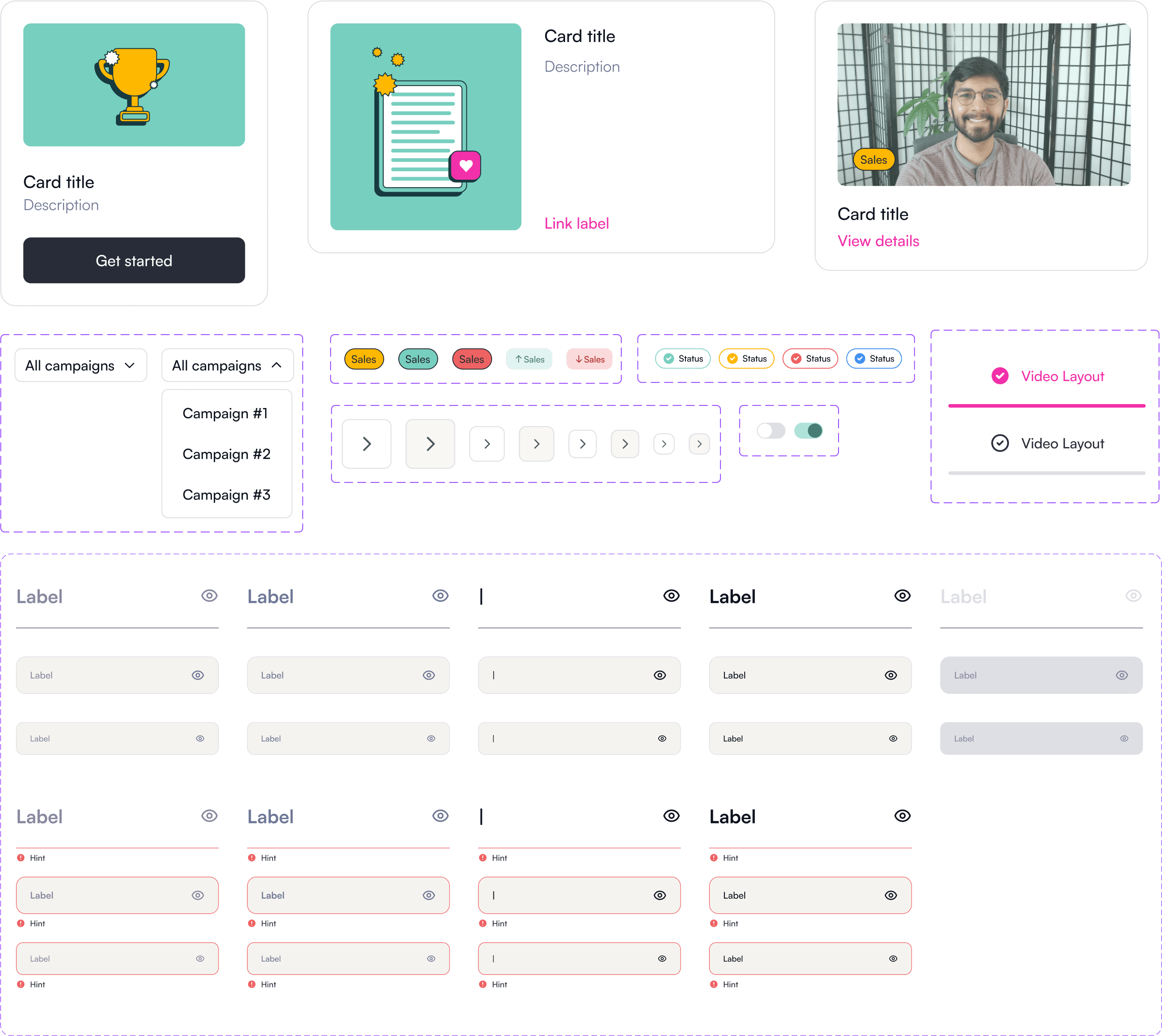
We created more engaging, immersive, and user-friendly illustrations by
leveraging
visual storytelling and simplified communication.


Our approach resultantly increased the app's engagement and retention rates. We could notice a significant rise in users' perception in a short span of 4 weeks.


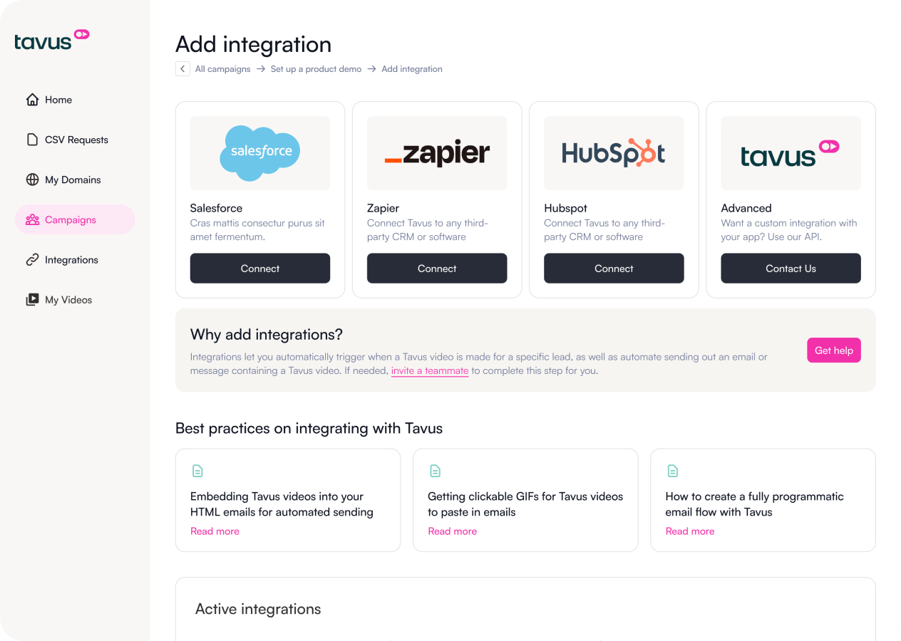
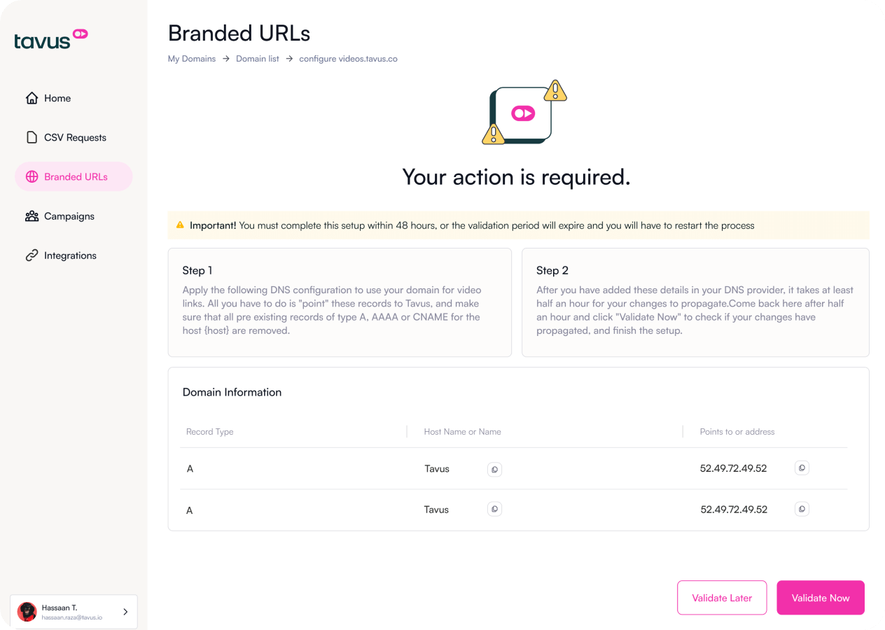
All our efforts translated into a highly immersive design system with a shallow learning curve and made it easy for the users to move inside the website and witness the power of a streamlined, hands-off outreach process.


The journey starts here. We're excited
to meet you.