We use cookies to give you a better browsing experience. Know how we use your data.
We use cookies to give you a better browsing experience. Know how we use your data.
The trading firm based out of Houston was working on an old and outdated internal employee portal where their employees needed help to locate the information that they needed promptly. Because of this, the portal was not being used at all.
The team partnered with us to redo the UI/UX of their system and consolidate their different pages in one dashboard.
While the project scope revolved around rebuilding a platform, our team knew that the efforts we had to put in were to be almost equal to creating one from scratch, especially because the target audience of the platform had given up on it and needed something completely new to stick to the application.
The extent of our association with the trade firm’s project was primarily focused on rebuilding their employee platform. Behind the curtains, however, we worked on multiple elements, from re-conceptualizing their idea and work processes, creating a new design system, and envisioning a new platform that kept a users-first approach.


The stage at which the portal came to us was both a happenstance and a challenge. We already knew what not to design but because the employees had a negative emotion attached to the platform, we had to ensure that what we were designing was extremely useful and intuitive

We built a user persona with a fresh outlook of what the employees wanted to achieve with the portal and the flow they would prefer to move from one screen to another. After building the wireframe of the portal with new features’ locations and screen flows, we went on to fill it with an interactive set of UI elements and intuitive in-portal movement that brought the learning curve to almost negative.

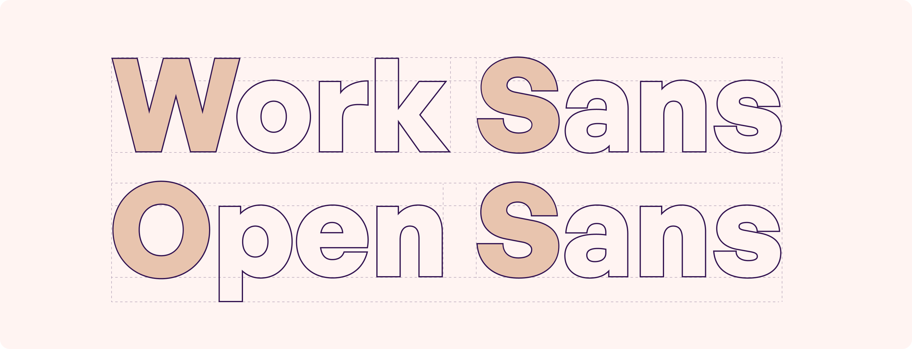
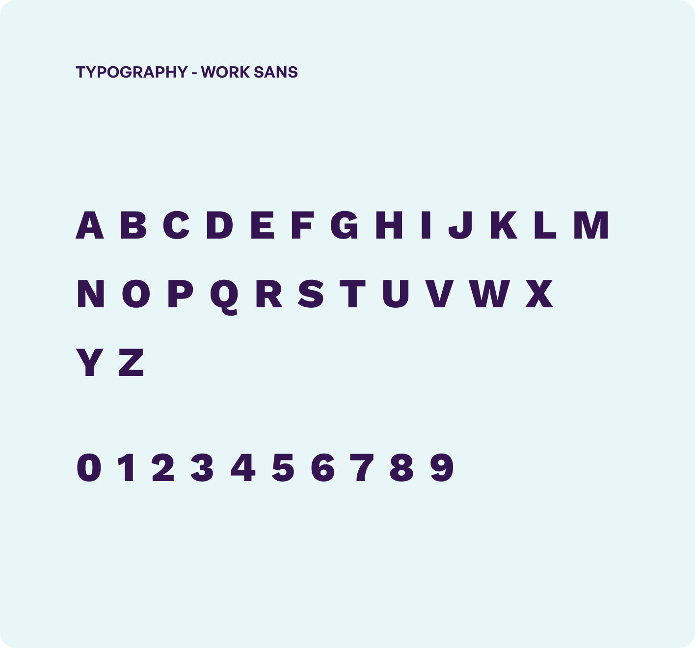
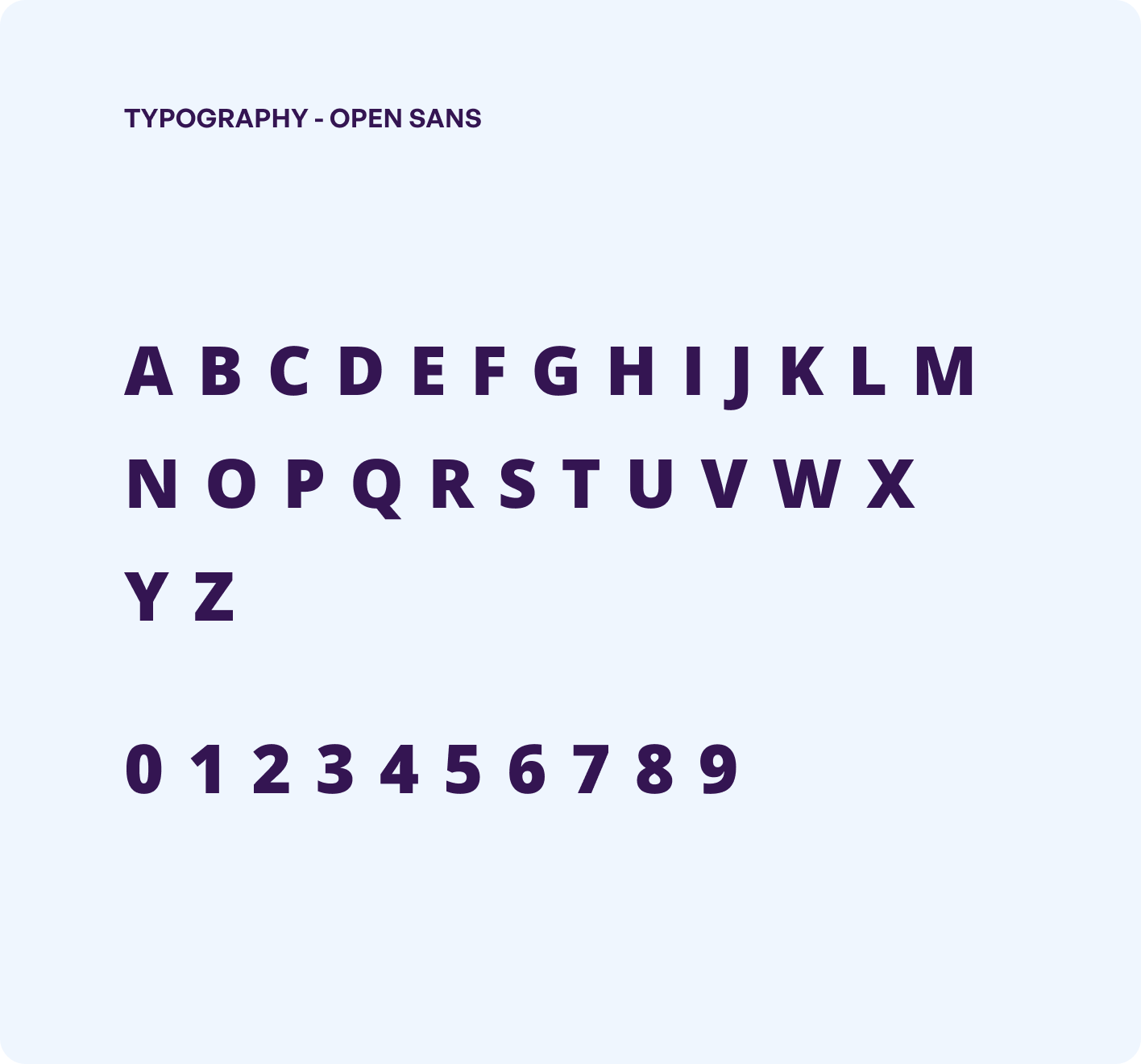

The development part of the trade firm’s portal was fairly straightforward. We had to convert the new UI/UX design into the frontend, in a way that the dashboard now acted as the house to all the different pages and information.
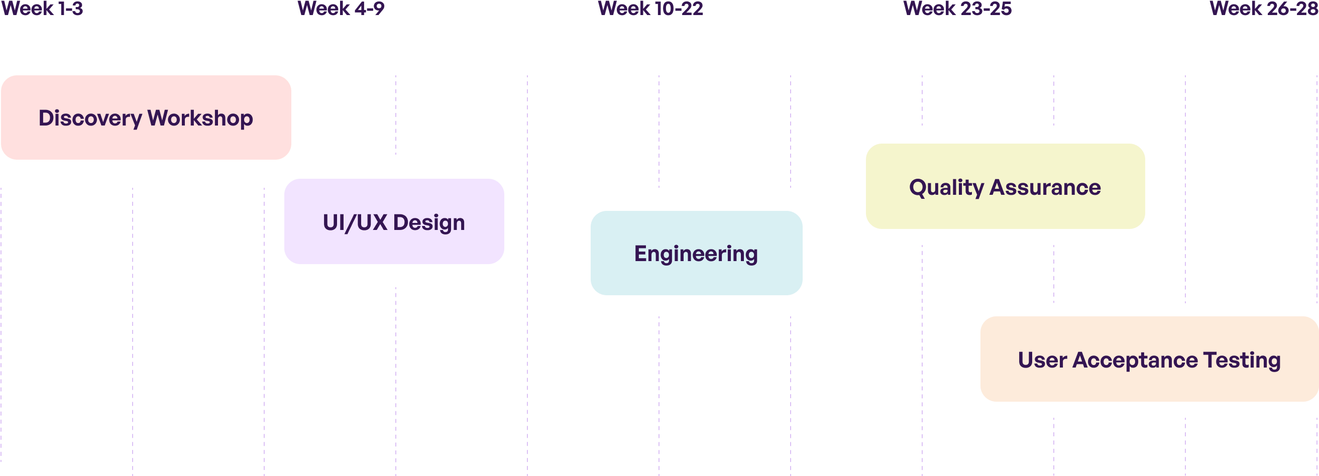
The idea was to keep the portal as minimal and intuitive as possible for the employees to have a quick in-and-out experience in the platform. After one month of extensive UI/UX and HTML work, we then deployed the portal by linking it with the trade firm’s backend with the help of an API.

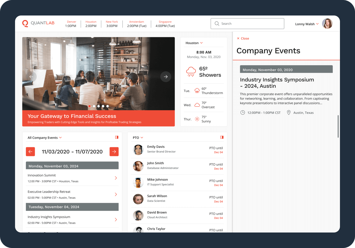
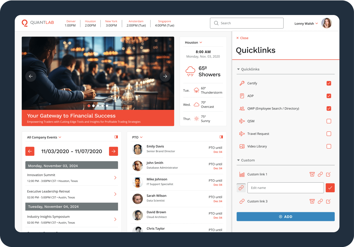
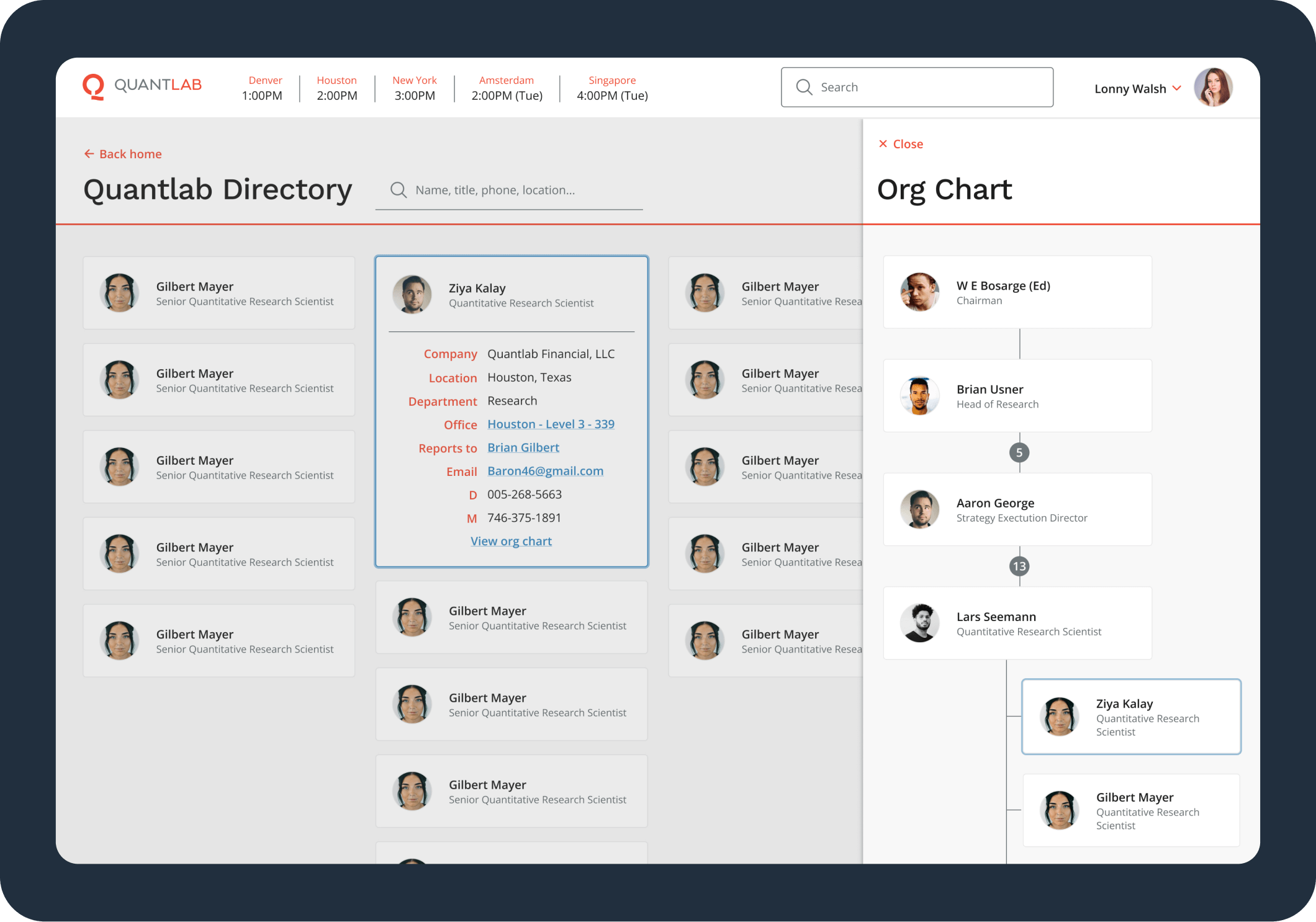
At the back of a dedicated focus and design, developmental efforts, we successfully deployed the application on the trading firm’s backend - all in a record time of 1 month. At present, the portal is witnessing a 75% increase in usage time and a sharp decline of 43% in the portal training time.


The journey starts here. We're excited
to meet you.