We use cookies to give you a better browsing experience. Know how we use your data.
We use cookies to give you a better browsing experience. Know how we use your data.
Opar was the outcome of a concept that would make it possible for people to share their experience with the trendiest venues and talk to, play games with other Opar users present in the same venue, anonymously. The idea behind the application was to inspire people to get out of their mundane lives, explore new places, and meet like-minded people.

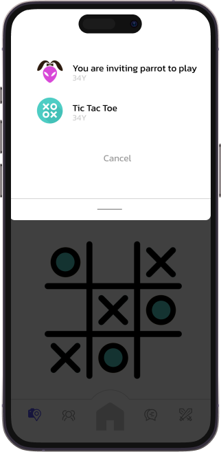
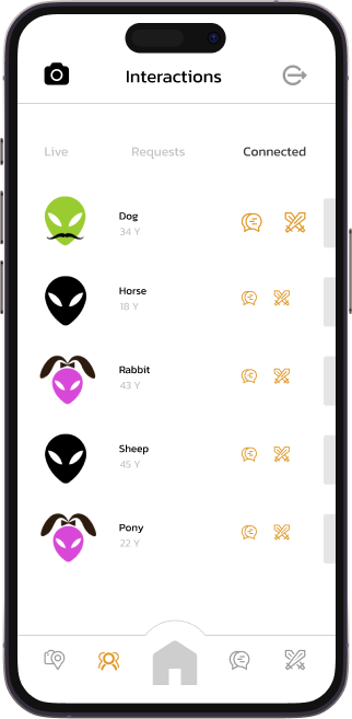
The Opar team approached us with an exciting concept for people looking to explore new places and meet people. Achieving this called for utilizing the true capabilities of geolocation facilities. From the early stages of our discussions, it was clear that location would play a key role in the app’s business model - users would check into a location and post images, videos with their geotag functionality on, they could message people who were in the same venue, and even earn coins by playing games with other Opar users present in the same location.
Noting the focus on geolocation, we brainstormed different use cases in which people would use the application and planned ways to make their experience rewarding.

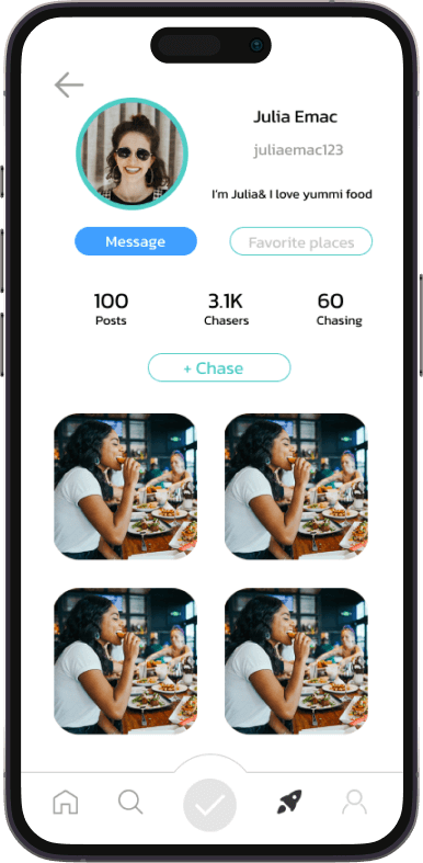
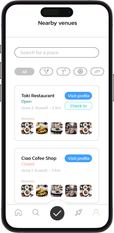
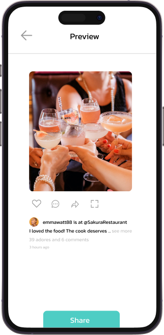
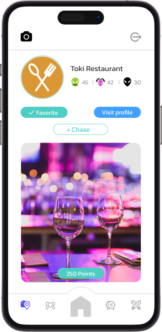
Opar's success depended on the perfect functioning of three features - social media-like media posting, commenting, in-app messaging, and gaming. Planning, designing, and building these features with high performance and security assurance translated into 52 weeks of agile development.


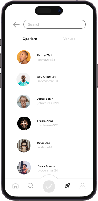
Just.Live design The Opar team came to us with 80% of the app’s UI/UX ready. Our role was to build upon the design system at the back of the need to evoke a mood switch that would take users out of their mundane but comfortable lives to one where they are going out and meeting new people. We could only achieve this by adding visually appealing, vibrant elements to the application. Our design team enhanced the existing UI/UX designs and made them more minimal yet color-rich while adding icons that both Gen Y and Gen Z would find easy to use.

On the development level, we engineered three architectures -
In-app messaging: one where users could only interact with other users in their venue and one where they could talk to anybody,
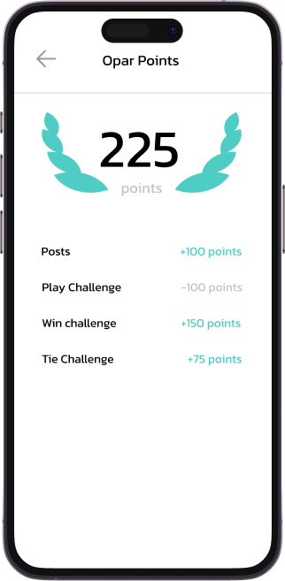
Two in-app games, built from scratch, on a points-based user engagement mechanism,
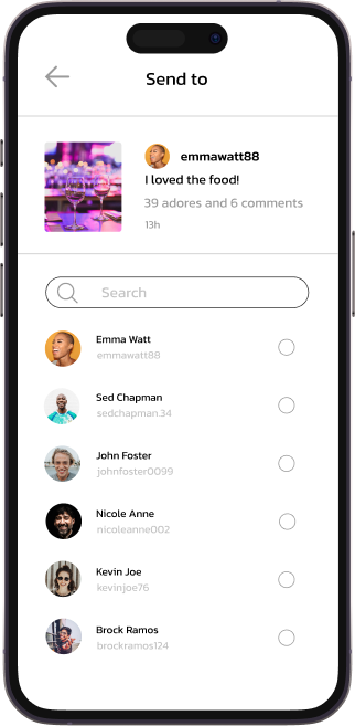
Social media interface for posting, commenting, and sharing venue experiences.
At the core of all these features was geolocation. Opar was designed so that users could only post, message, and play games with a specific segment of users while inside a venue. This led to a situation where they had to be checked out from the application when they left the venue’s coordinates.
Ensuring geo-location-based checkout in multiple network conditions called for including the best technology stack and team size.


Following the design and development of a feature-rich, engaging version, Opar is in the pipeline for its final deployment and launch. We are confident that, upon its market release, Opar will instantly resonate with Gen Y and Gen Z users seeking addictive, gamified social media experiences.


The journey starts here. We're excited
to meet you.