Both Android and iOS platforms have promising app ecosystems, hardware compatibility, robust technological innovations, and market diversity. While competitors like Windows Phone and Palm OS have come and gone, these two have remained flexible, stable, and safe over the years. Owing to their efficiency, the global mobile application market size stood at $228.98 billion in 2023 and is expected to grow at a 14.3% till 2030. Thus, when it is about operating systems, these are the sole choices in 2024.
Now, this article particularly looks at the difference between Android and iOS UI design in terms of aesthetics and functionalities. It is an important aspect when businesses are considering mobile app development services to build native apps that will help them step into the digital world. Having a clear concept helps set a product roadmap, outline a design sprint, decide on the budget, and hire designers as per requirements.
Overall, a detailed idea of the platforms will help convey accurate requirements to the designers and fulfill end-goals like competitive advantage, broader audience reach, and the ability to maximize device capabilities. Let’s get started with Android vs iOS UI design.
Table of contents
What are the specific UI design rules for Android and iOS ?
Material design, maintained by Google, is the standard when it comes to developing Android applications. The standard is in terms of notifications, fingerprint, snackbars and toasts, launcher icons, and split screen on Android apps. Let’s explain the first one to give you a glimpse into how Material Design is incorporated. For instance, the components of notifications are header, content, and actions areas which are noticed by status bar icon, playing a sound or vibration, blinking device LED.
Human Interface Guidelines (HIG) , maintained by Apple, contains guidelines for iOS best practices in application development. The core rule is crisp elements with minimalism and loads of Apple technologies. These are applied across game controls and designs, immersive experiences, controls, widgets, live activities, accessibility, typography, SF symbols, writing, patterns, components, and icons.
In a nutshell, these design compliance ideas are what businesses and designers need to know in UI to avoid breaking the design consistency that Apple and Google expects from the apps active on their platform. Now at this point, you must be thinking, how to get started?
Introducing Simublade, the best UI UX design company in Houston that aims to transform businesses through design innovation. Our best-in-class designers know the Android vs iOS UI design variations and pick the best-suited tools. This includes Figma, Adobe Animate, Sketch, Adobe XD, Zeplin, Illustrator, and Invision Adobe Cloud for design revamp, design consulting, experience design, and interface design that merge business strategy with user pain points.

What is the difference between iOS and Android UI design?
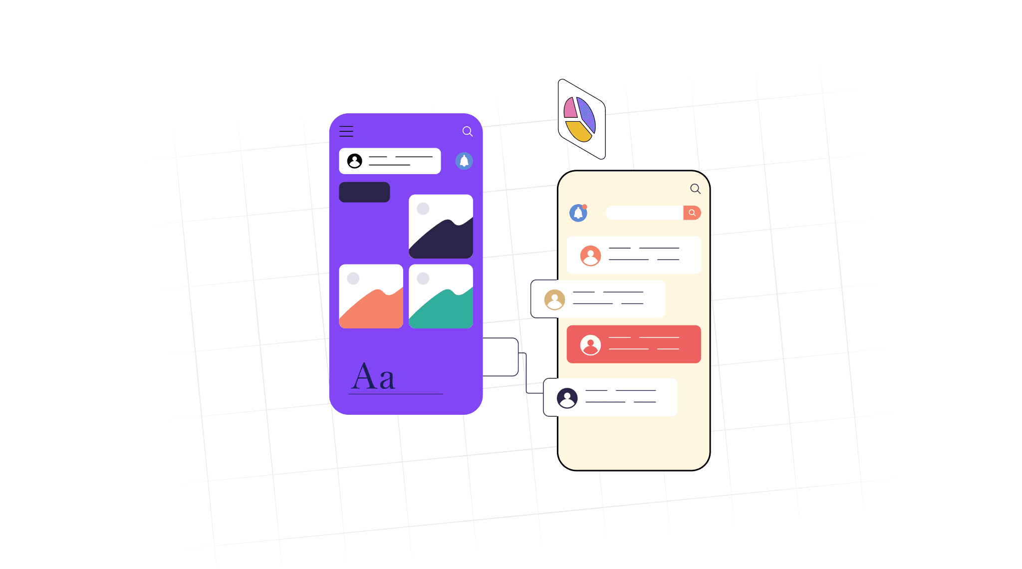
Android and iOS are the two pillars of the smartphone world facilitating innovation to create a rich digital experience for users. However, despite being an epitome of technologies, both do not complement each other. Let’s see an Android vs iOS comparison design for clarity to understand how well-built and functional apps can ensure robust digital transformation for an organization.
1. Navigation
Consistent navigation is one of the core elements of an app that help users reach different pages, be familiar, and enjoy the experience without confusions. Of course, an Android app design and an iOS app design have two different navigation structures. While Android follows a hierarchical navigation pattern, iOS follows a tab-based navigation pattern and has three frameworks namely, drill-down, flat, and pyramid. Below are the different detailed categories and their differences.
Primary navigation
Primary navigation is the principal navigation component that offers access to all app destinations.

Android app design follows a hamburger menu with floating action bars. This means, all the features are stacked on top of each other, like that of a hamburger, and are well-organized and easily accessible.
iOS has a primary navigation component that offers access to all destinations right on top of the hierarchy. It is a flat pattern which helps to store functions that happen once in a while.
Secondary navigation
Secondary navigation is typically present in complex apps and leads to additional information that might not be of primary importance.

Android secondary navigation’ hamburger drawer opens from left to right. This is called the side panel or slide-out menu which is quite common. The additional information, which is stored here is not of primary importance yet is accessible to the user and is significant in some way or the other.
On iOS, there is a global navigation bar right at the bottom of the app screen. Less important elements like interface features, photos, and phrases are here under a ‘More’ section.
These secondary navigation is typically found in large complex applications.
Back navigation
Back navigation helps users move backward or in reverse chronology through screen history.

All Android apps have a ‘back’ navigation option so you reach the previous tab. However, most devices have a button for this usage. So, not adding it in the UI design would also work. Android also has a robust ‘back stack of destination’ for the ease of users.
iPhones do not have a specific ‘back’ button but have a software-based solution for it. This means users have to swipe from left to right on the screen. They can also use the on-screen top-left back button to return to the previous page.
2. Tabs
While considering an iOS vs Android comparison, tabs are quite crucial.

iOS tabs do not specifically have a ‘tab’ while Android has a flat design for the same. Tabs in Android help organize content across multiple data sets, screens, and interactions. They are typically found on the top right of users’ screens and help designers to ensure a personalized browser experience, if necessary.
3. Buttons
Buttons are indispensable for input, user interaction, and navigation. So, these must be built in a compelling manner so as to trigger users to click and take actions. Designers start the process with visually appealing button designs that reflect style, content, and a system-defined role. Motion graphics and animation are a critical component of designing click-friendly buttons.

The Android vs iOS user experience depends on the button styles as well. Android typically has a Floating Action Button (FAB) with a shadow. These are placed on the top navigation bar because generally Android phones are large (up to 7 inches) making them apt for users with big hands.
For iOS, the buttons are flat and are present on the top navigation bar towards the right. It can also be seen in the bottom navigation bar in a few apps since the screen is small and can help users reach the button quickly. Designers can choose from various types like custom buttons, buttons with images, bar buttons, action sheet buttons, and styling buttons as per business requirement. The placement will depend on the screen’s layout.
4. Gestures
Touch gestures are little motions for app interactivity. They help lower cognitive load which ultimately makes user experience natural, intuitive, engaging, and efficient.

The range of gestures in Android is detailed and allows tapping, swiping, and long-press actions like double taps, pinch, swipe, long-press, fling, and drag. For example, users can see all open apps by swiping up from the bottom, hold, and let go.
iOS, however, has limited gestures like swipe, pinch, zoom, and tap. Yet users can enjoy a highly immersive experience with focus on content.
5. Icons
The screen structure in both Android UI design and iOS UI design is built from an 8dp grid and 16dp grid. An estimated size for icons for iOS and Android apps are thus 180×180 px and 48×48, respectively. Designers typically check and export at bigger multiples as well, as per the app design requirement. ![]() Icons are tiny and static yet must be designed thoughtfully, much beyond just an introductory glimpse of an app. UI/UX designers mostly use Illustrator, Sketch, and Photoshop for creating them. Regardless of the difference between Android and iOS app design in terms of icons, the following features must be ensured across both platforms :
Icons are tiny and static yet must be designed thoughtfully, much beyond just an introductory glimpse of an app. UI/UX designers mostly use Illustrator, Sketch, and Photoshop for creating them. Regardless of the difference between Android and iOS app design in terms of icons, the following features must be ensured across both platforms :
- reflects professionalism and dependability
- flexible design to accommodate moment marketing
- beautiful, memorable, and click-worthy against any background theme
- the symbol should reflect the expected app functionality
Keeping the above points in mind will impact the overall branding by boosting visibility on the App Store or Google Play Store. A well-designed icon also helps ensure positive user perception and engagement behavior. It is useful for both a new app or while upgrading an old one.
6. Typography
Typography enhances user experience while making the app content readable. Brands are also able to display the tone and sentiment and ensure high-quality aesthetics.

There are distinct Android vs iOS design differences when it is about the typography. For instance, Android apps have been using a Roboto font since 2013 which is a Sans-Serif font specialized for mobiles. For instance, the font that we see in YouTube, Google Images, and Google Maps. Google does not plan to change this anytime soon.
iOS app design uses the San Francisco font which is also a Sans-Serif font. So, the basic size between both Android and iOS fonts are the same. However, Android has more of white spaces in the text design while Apple apps focus on text hierarchy.
7. Scrolling
For every 5 seconds of phone usage, a person scrolls 30 cm on an average. This is why it is hard to rule out the importance of a decent scrolling structure and understand it in terms of the difference between Android and iOS UI design.
Android uses a Scroll View option that ensures vertically scrollable views. Horizontal Scroll View can also be used that provides a child view element, more like a linear layout which is typically common for complicated UI designs.
For iOS, the navigation bar continues to shrink in width as you continue to scroll and slowly the Toolbar vanishes.
8. Search
In an Android vs iOS design comparison, a search bar is a notable factor. Users are more likely to stay, explore the pages, and take actions because they found the information conveniently which saved time and increased their app likeability.

Androids have a floating search bar on top of the screen with cancel query and cancel search mode options. On the other hand, iOS has two options namely ‘hidden’ and ‘prominent’ with clean query and clean search options. The color, shape, and transparency are the top factors to consider when designing it.
9. CTA
Compelling call-to-action buttons guide the user journey and encourage them to click and take an action. A well-built one makes sure the app users do not bounce off due to confusions. This increases the chances of more leads and better revenue.
When considering the difference between Android and iOS app design, CTA is a prominent factor. Android app pages have the CTA in the bottom-right as a floating action button (FAB). On iOS, the CTA appears in the upper-right corner.
Besides these elements, Simublade’s UI/UX designers can also help with brand storytelling, interface design, design revamp, design consulting, and experience design. We offer a range of services like design consultancy, mind mapping, wireframing, prototype creation, and design guidelines for developers. All of these are made possible with the Agile development process which ensures fruitful collaboration with businesses.
Can Android apps be designed to look like iOS and vice versa?
Yes, it is possible despite the difference between Android and iOS app designs. The process is called repurposing or cloning and has plenty of benefits. For instance:
- time-efficient and less-tedious process
- target different user segments with unique versions
- saves capital investment and resources
- massive customization scopes for elevated experience
Further, brands can also port their apps from Android to iOS and vice versa. Hire adept designers like us starting at just $25/hr who will check the compatibility, guidelines, and UI UX design changes, and then use the right conversion tool.

Conclusion
UI is a core element of brand aesthetics. Studies found that 94% of users impression is created by the initial design of a digital platform. A good one increases the chances of conversions to up to 200%. No wonder big brands like Apple and Nike focus on the look and feel of their apps and ensure they are instantly recognizable.
So, understand the Android vs iOS user experience intricacies, collaborate with designers, and convey your vision to create an innovation-first app. Rest assured that the same approach is followed regardless of whether you wish to redesign a software or build a new one. The end result would be better brand awareness, improved customer satisfaction, increased productivity, and guaranteed user retention.