Think of stepping into a room and interacting with only a keypad and a screen? Well, this could be a little difficult without proper instructions, layouts, and navigation bars, right? The exact same goes for apps. Customers, especially the ones with cognitive disabilities, might be confused without core elements. So, as a business bringing apps and websites to life, creating digital spaces where users, regardless of their skills and abilities, can enjoy the experience is imperative. In fact, you must strive to curate a space where everyone, including those who are not the target audience, feel welcome. Advocating the importance of designing for accessibility would reflect that you are truly a brand that is friendly and convenient.
The global accessibility testing market size is expected to reach $825.43 million by 2032 growing at a 4.32% CAGR between 2024 and 2032. This further emphasizes on the importance of being inclusive of customer needs and building a user-centric app to be able to stay in the forefront of their minds and leave competitors behind.
Let us understand the concept in detail and why the importance of accessible app design is growing in recent years. Read on to learn more about it.
Table of contents
The top business benefits of accessible design
By prioritizing accessibility, a good mobile app UI UX design can offer a handful of benefits to help your business reach its utmost ROI potential. Here’s a look.
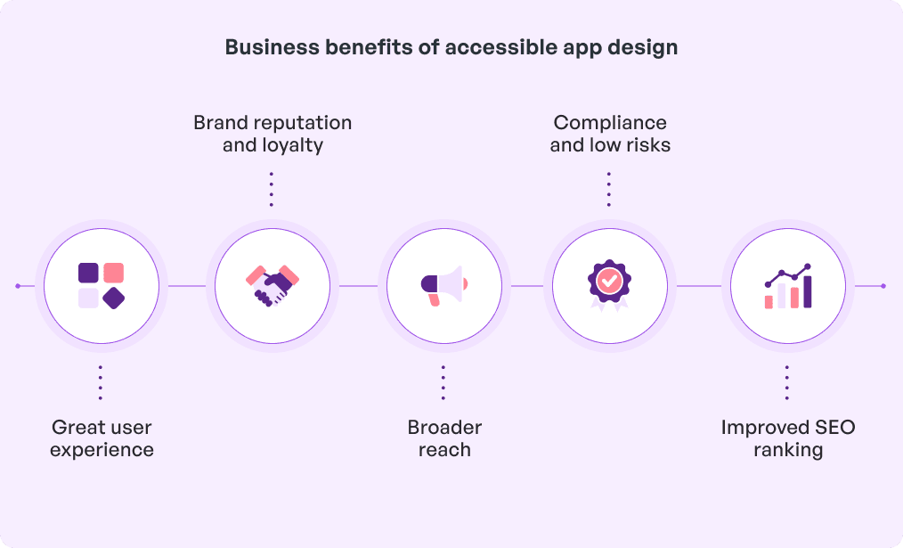
1. Great user experience
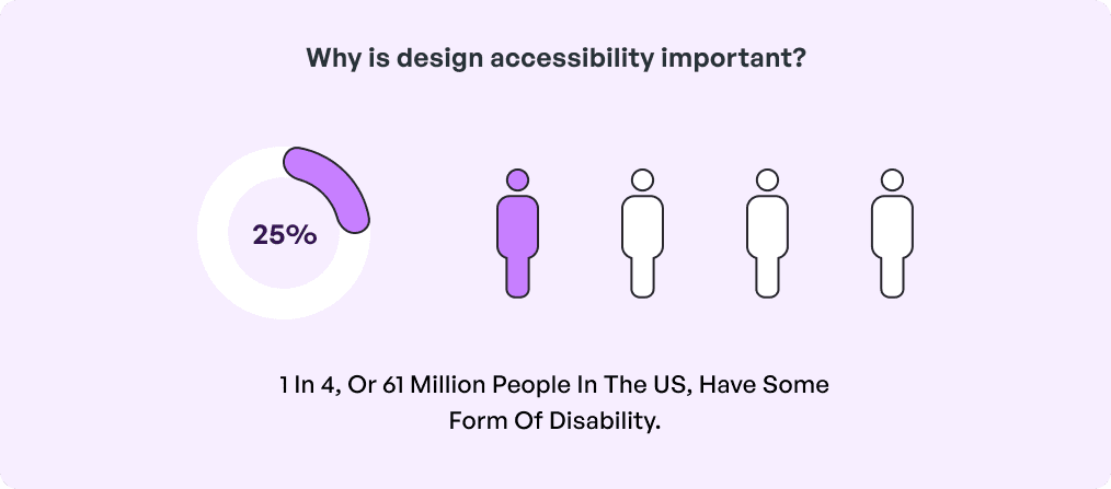
The importance of accessible app design is not solely for disabled people but for the entire customer base. Features like transparent labels, legible text, and uniform structures enhance the app experience even in certain conditions like low light or in a noisy surrounding. In addition, a more focused and uncomplicated design makes it easier for users to interact which helps promote cross-generational engagement.
2. Brand reputation and loyalty
By focusing on accessibility, companies demonstrate that they stand up for inclusiveness and therefore fulfill their social responsibility. This is one of the easiest ways to boost brand reputation since most customers relate well to accessibility. Thus they become loyal consumers over time which ultimately leads to effective long-term relationships.
3. Broader reach
Studies have found that 70% of people with disabilities use apps. So, personalizing them with accessible design opens up the user base to include people with limited capabilities. By catering to different needs, including visual, auditory, and cognitive impairments, businesses can attract a diverse group of users who might otherwise be unable to use standard apps. This inclusivity can significantly expand the app’s market share and increase downloads.
4. Compliance and low risks
UX design for accessibility in some places is required by law, for example, the Americans with Disabilities Act (ADA) or the Web Content Accessibility Guidelines (WCAG). Failing to meet such requirements can trigger expensive lawsuits and penalties. Making sure that a business is accessible ensures that it is compliant with the legal requirements in the respective distances and minimizes the chances of going through legal proceedings. Further, addressing accessibility offers cybersecurity because the risks of human errors are minimal. This protects the finances and reputation of the business.
5. Improved SEO ranking
Accessibility features in the form of alt texts on images, content optimization via structural heading, and transcripts for any video content are well-aligned to SEO best practices. Thus the content of your app becomes more discoverable on search engines. Ultimately, search rankings surge with higher organic traffic going to the application with enhancing user acquisition and engagement prospects.
Key principles of accessibility in design
Here’s what brands must strive to follow to ensure inclusivity in user experience.
Perceivability: Businesses should present information in a way that all users can understand. The best way to start off is transcripts for audio and alt text for images.
Operability: Consider creating interactive elements that work with different input methods like keyboards, voice commands, or touch.
Easy-to-use forms: Create forms with straightforward labels, clear error messages, and user-friendly controls to make filling them out a breeze.
Understandability: Strive to make content and navigation convenient by incorporating simple language and consistent design patterns.
Here’s a simple example to help you understand how design for accessibility, be it on physical products or apps, can be significantly helpful.
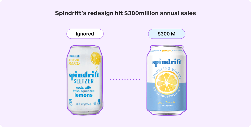 Robustness: One of the top accessibility considerations in UX designs is ensuring it works with many devices and assistive technologies to stand the test of time.
Focus management: Allow for logical and predictable navigation for people who use keyboard or screen readers.
Text readability: Pick easy-to-read font sizes, high-contrast colors, and flexible layouts for reading in various settings.
Inclusive media: Add captions, audio descriptions, and changeable playback speeds for multimedia content.
Quick responses: Give instant and easy-to-grasp feedback for user actions to keep people in the loop and sure of what’s happening.
Following these principles can help you stay within the standard range of mobile app design costs and avoid expensive repairs later. Now, let us look at the best practices to follow while considering accessible UX design.
What are the best practices for accessibility in design?
According to app design, accessibility makes it easy for everyone, including the less advantaged, to use applications efficiently and effectively. Below are a few best practices:
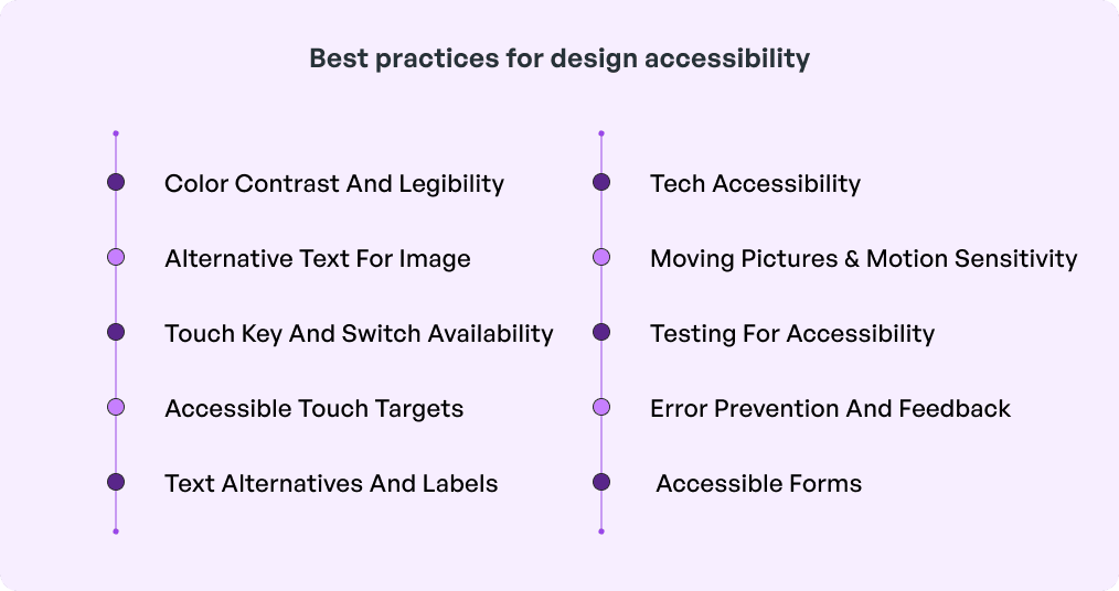
1. Color contrast and legibility
High contrast: Preferred color combinations of high contrast between text and backgrounds in order that textual information is not lost and is easily readable. For example, try black letters on white background for ultimate contrast.
Avoid color dependency: There are things that cannot be effectively explained by color alone. Therefore, utilizing even additional signs such as labels or icons can be helpful.
Font size and weight: Choose myriad font sizes and weights that can be easily read by viewers. For textual information, let users choose the font size of the content displayed within an application or by means of the settings of their smart devices.
2. Alternative text for images
Meaningful descriptions: Give image description for images icons and other objects that are non-textual so that they can be understood by the screen readers.
Avoid redundant descriptions: Leave the alt attribute empty in decorative images to effectively make the screen reader completely ignore them.
3. Touch key and switch availability
Keyboard navigation: There should be an option for users to access the application solely by a keyboard, especially for people with motor disabilities.
Logical focus order: Ensure a proper and reasonable tab sequence for controls is being assigned which is important for keyboard and switch device users.
Visual focus indicator: Make it easier to determine which of the elements is active by including easily spotted focus indicators.
4. Accessible touch targets
Minimum size: Make sure touch targets are at least 44 x 44 pixels in visionOS because Apple recommends this for people with motor difficulties to boost accessibility in user interface design.
Spacing between elements: Another touch targets can be placed far apart along with avoidance of touching them by mistake.
5. Text alternatives and labels
Clear labels: Make good use of labels in buttons and icons, and for form fields. This is beneficial to both the disabled listeners via screen readers and customers with cognitive impairments.
Consistent terminology: Try to maintain consistency in terms for actions and verbs throughout the application of the app, for instance, submit and send.
6. Tech accessibility
Screen reader optimization: Make sure that the app responds to other screen readers including VoiceOver (iOS) and TalkBack (Android).
Descriptive ARIA labels: They should add ARIA (Accessible Rich Internet Applications) labels in order to enhance the voice-over’s awareness of each element’s role and status.
7. Moving pictures and motion sensitivity
Reduced motion option: There has to be an option to lessen or disable animation where this motion can disturb users by making them feel slightly distracted or dizzy. Avoid flashing content: Notifications, Marquee scrolling information, and blinking portions should be eliminated or restricted to reduce provoking epilepsy, a sensitive form of seizure. It is especially true if you are planning to use AR/VR effects in the app since a study found that 65.2% people experience cybersickness in different forms. Further, too much flicker and flutter might be disturbing for senior customers willing to use your app.
8. Error prevention and feedback
Clear error messages: Provide clear and constructive error messages where people get an understanding of what went wrong & know how to fix it.
Input validation: User feedback should be checked as soon as the user tries to submit inputs to minimize cases of mistakes and increase UI UX design for accessibility.
9. Accessible forms
Input field labels: Every input field should be named and more to the point with the type of information that the user is expected to provide.
Field descriptions: Describes additional functions or additional ideas which will help users enter the proper data.
10. Testing for accessibility
User testing: As much as possible, involve the disabled in the testing so that you can get the feedback as direct as possible.
 Accessibility tools: Run Axe, Lighthouse or WAVE frequently in the beginning phase of design to spot and rectify the basic mistakes.
These best practices ensure that everyone, commonly referred to as the disabled can easily use applications and have a better experience than the supposedly normally abled users.
To ensure that the key principles and the best practices for design accessibility are being followed, collaborate with a leading UI UX design company like Simublade. We merge design capabilities like micro-interactions and brand storytelling with technical expertise to build immersive digital experiences. Our expertise in elements like icons, scrolls, animations, and buttons makes user journey smooth while fostering conversations.
Which tools are required for accessibility in design?
Check out the key tools to use if you are wondering how to design apps for accessibility.
WAVE (Web Accessibility Evaluation Tool) – Scans web pages for accessibility problems and points to subsequent improvements.
Axe – A tool for testing the accessibility of Internet applications that works with browsers and developers’ tools to detect problems.
Lighthouse – Google’s tool for testing the accessibility straight from the Chrome DevTools.
Color Oracle – Helps visually impaired people ‘see’ how designers visualize and determine whether or not the color combination is good for people with color blindness.
Contrast Checker – This determines the contrast between background colors and the text to ensure high read ability.
NVDA (NonVisual Desktop Access) – An open source application and probably the most famous screen reader for evaluating how the visually impaired usually engage with content.
VoiceOver (iOS) & TalkBack (Android) – Mobile screen readers that are integrated iOS and Android platforms to determine the accessibility of the apps.
Will, Nate and Georges – An accessibility plugin which can detect the color contrast, add alternative text and more, and works with the Figma, Sketch, and Adobe XD design files.
ARIA (Accessible Rich Internet Applications) – Proposes attributes to elements to enhance 3/4 screen reader cognition and interactivity for people with disabilities.
ANDI – A free web-based name and description accessibility browser tool.
Conclusion
The future of design for accessibility is already promising since it is now less of an add-on and more like a fundamental part of design. Future technologies including the AI and AR/VR pledge to provide unique features that will drive user-specific access and customizations. Higher awareness and legislation are two factors pressuring companies to inclusively design their products to deliver them to the broad target market.
Further, the tools and resources used by the best UI UX design agency like Simublade are constantly improving thus allowing designers to implement accessibility from the scratch. In conclusion, what design has in stock for the future will ensure universal usability thus creating a more inclusive digital world.
FAQs
Q. What does accessibility in app design mean?
Ans. Accessible app design means creating apps that can be easily used and navigated by people of all abilities ensuring inclusivity and equal access.
Q. Why is designing for accessibility important in app development?
Ans. The importance of designing for accessibility is that it ensures inclusivity, allowing people of all abilities to use and benefit from the app effectively.
Q. What are the key principles of accessible app design?
Ans. The key principles of UX design for accessibility are perceivability, operability, focus management, text readability, and quick access to name a few.
Q. What are the business benefits of designing apps for accessibility?
Ans. Business benefits of accessible UX design include improved SEO, broader reach, better brand awareness, and overall a great user experience.
Q. What are some key accessibility features to include in a mobile app?
Ans. Key accessibility features in a mobile app include screen reader support, high-contrast visuals, adjustable text sizes, alt text for images, and accessible navigation options.
Q. How does accessibility improve overall user experience (UX)?
Ans. Accessibility boosts the overall UX by making products easier to use, ensuring inclusivity and a smoother and more intuitive experience across diverse user needs.


